Row emerges over removal of Whitby and Filey town names from new Scarborough Council logo


Cllr David Chance, who, at the time of the meeting, represented the Mayfield ward in Whitby, questioned council leader Cllr Steve Siddons as to why the two towns were "insultingly deleted" without consultation.
He said the new logo gives the town of Scarborough "primacy" and removes the "long-established reference to Whitby and Filey".
Advertisement
Hide AdAdvertisement
Hide AdThe oval logo, pictured, makes reference to the three towns on the coast and includes imagery of Scarborough Castle and Whitby Abbey.
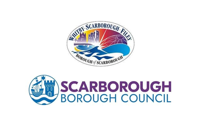
Cllr Siddons said the oval that Cllr Chance was referring to is not actually a council logo, as it does not say Scarborough Borough Council on it; but acknowledged "it has been seen as that for many years".
He said it is actually a place brand for the borough of Scarborough and added that it had not changed and is still used in many locations.
"I apologise if people feel that what happened with the logo is insulting, it was never intended to be that," Cllr Siddons said.
Advertisement
Hide AdAdvertisement
Hide AdScarborough Council said the new brand identity and logo was introduced last summer, and first appeared across the authority’s social media channels in early September last year.
Cllr Siddons added that as the new brand identity relates to the council alone, a corporate decision was made in consultation with the cabinet.
The new circular graphic element of the logo is based on the borough’s traditional heraldic crest, which has been in place since the council was originally formed in 1974.
The coat of arms, which feature in the new logo, is based on the town’s seal that dates from the 13th Century and illustrates the harbour and castle.
Advertisement
Hide AdAdvertisement
Hide AdThe town's original seal featured a lymphad (ship) to signify the seafaring traditions of the area and a star with eight points. This was reduced to seven points in the town's coat of arms to represent the seven former local authorities that were united to form the new borough. In the new logo, the star's points have again been reduced to six.
Cllr Siddons said: "The place brand will continue to be used until the new unitary authority comes into being; and I would be very surprised if Whitby, Filey or Scarborough will be specifically identified on that logo when it’s finalised."
It was announced in July 2021 that the current county, district and borough councils would be replaced by a new single council for North Yorkshire in April 2023.